by Damon Webb | Jul 3, 2019 | Case Study
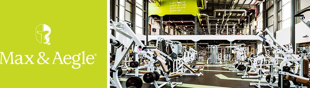
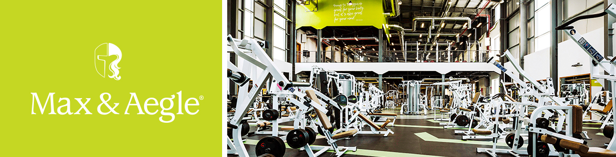
From a blank piece of paper to a global first Max & Aegle is a health club that focuses on the bigger picture of wellness, underpinned by our strategic platform; Macro Health. It was from this platform that we created the brand name and developed its visual and...
by Damon Webb | Jul 3, 2019 | Case Study
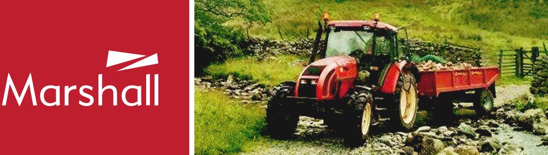
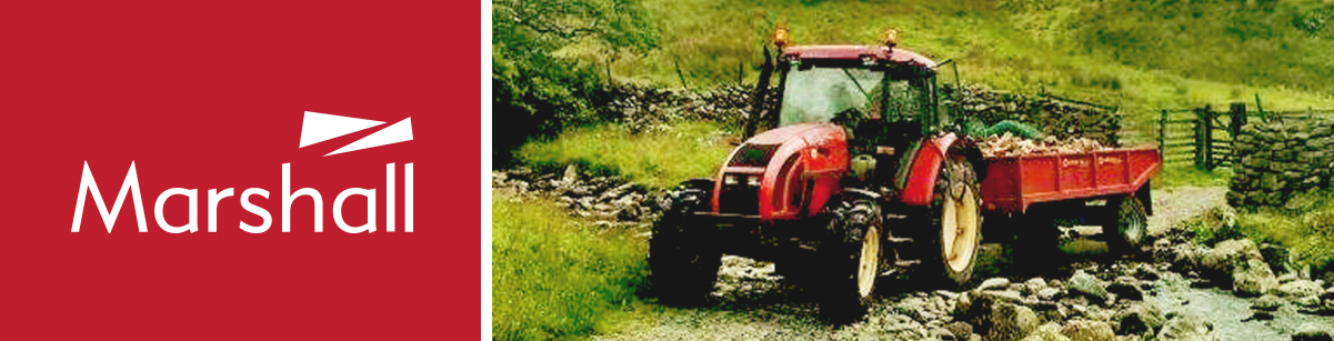
Delivering a modern brand for a modern business Although one of the leading manufacturers of specialist trailers and farm equipment across the UK, Marshall’s brand identity didn’t support the ambitions and aspirations of this family owned corporation. Working very...
by Damon Webb | Jul 3, 2019 | Case Study
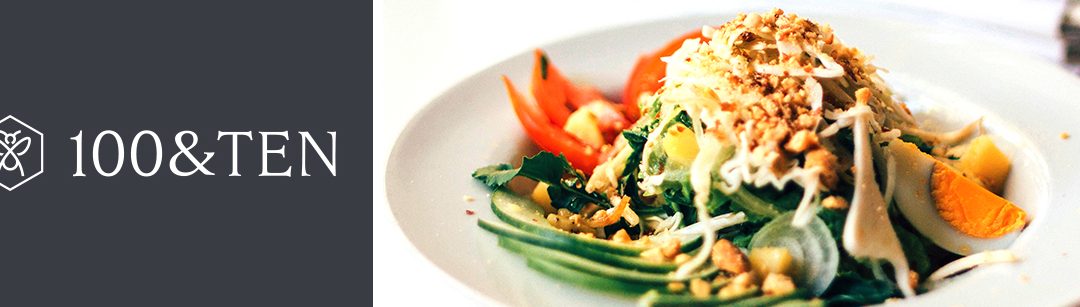
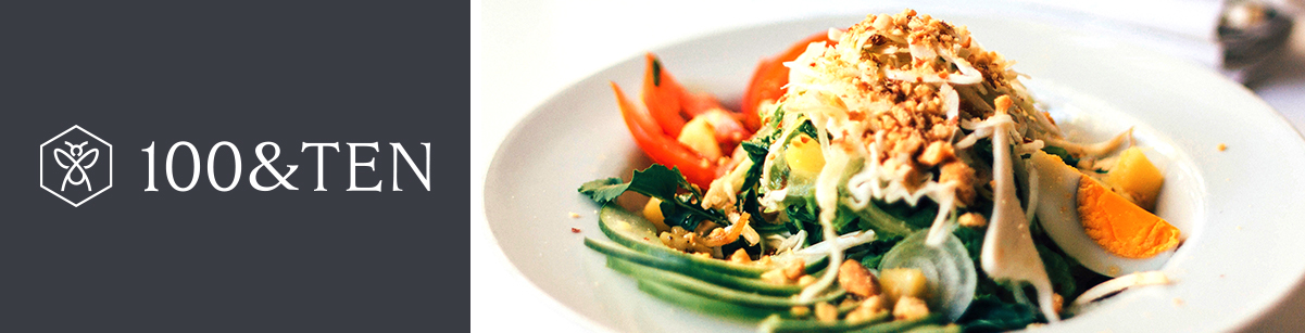
Creating a brand to embody a world of healthy taste Working within the existing wellbeing world of Max & Aegle we developed the 100&TEN identity as a partner brand. To represent the same principles and ethos. To achieve this we had to define the name and then...
by Damon Webb | Jul 3, 2019 | Case Study
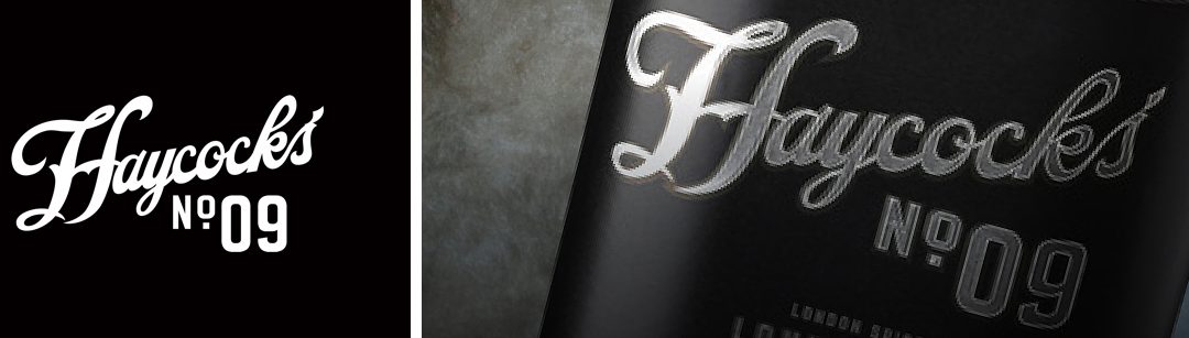
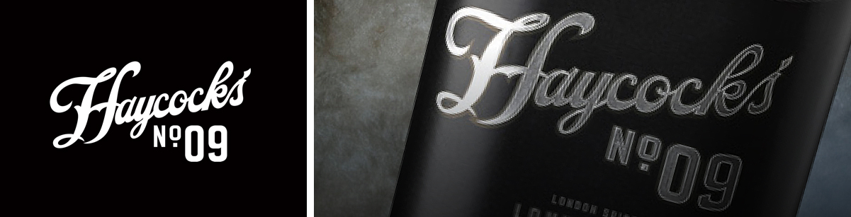
Brand development and activation The Haycock’s Drinks Company is another entrepreneurial team we are proud to have supported with the Public approach. They clearly had a vision for their first creation, Haycock’s No.9 London Spiced Liqueur, but were struggling to...
by Damon Webb | Jul 4, 2019 | Case Study
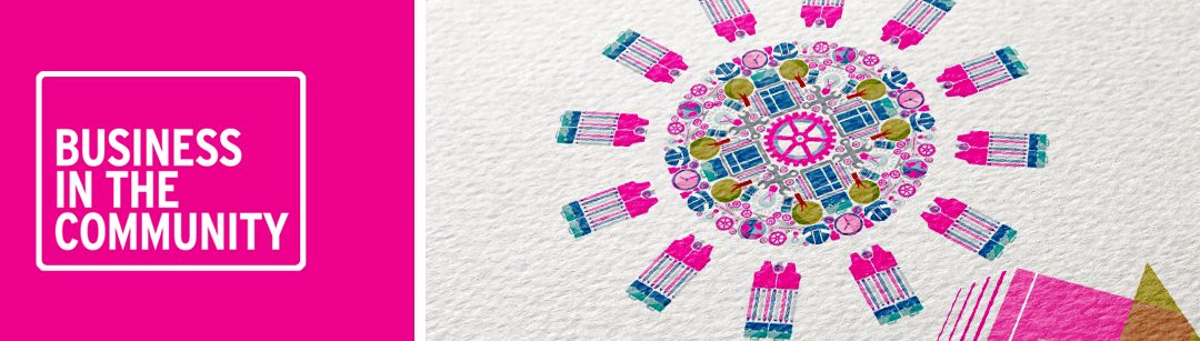
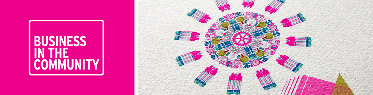
Revised visual platform and creative identity We created a fresh and inspiring new visual
identity to drive awareness and engagement with the Business In The Community annual awards programme. Clever rearrangement and re-purposing of
a number of existing design...
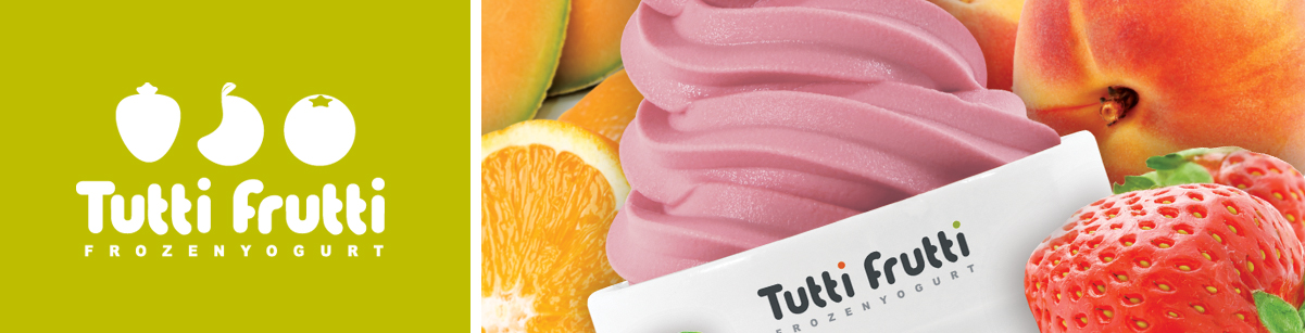
by Damon Webb | Jul 11, 2017 | Case Study
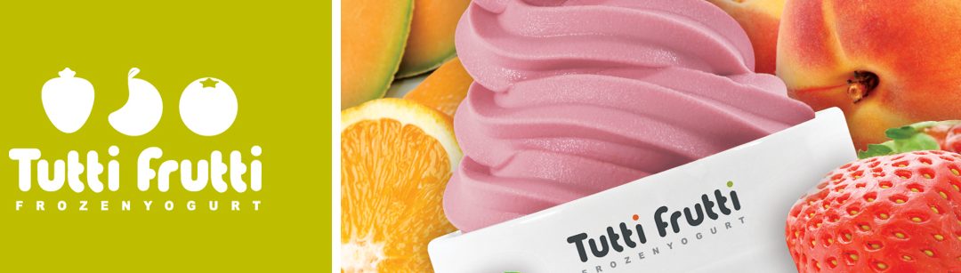
UK launch and brand marketing Taking on the challenge of launching the world’s biggest frozen yoghurt brand across the UK; to
an audience that had little or no experience of
the category. Using the intrinsic healthy and fun personality of the brand, a series of...
Recent Comments